DJI Computer Solutions
Software Applications for Microsoft Excel
The most unique, full featured spreadsheet applications on the web. These are not your father's spreadsheets!
The most unique, full featured spreadsheet applications on the web. These are not your father's spreadsheets!
![]()
The Summary Chart tool (shown above) provides a method for charting income or expenses on either the Ledger Summary or Report Summary worksheets. The chart can be changed to show the expense or income categories of your choice. To create the chart, click the Summary Chart tool to display the Summary Charts form. Choose whether you wish to chart Expenses or Income categories and check the expense/income categories you want to chart. Select the type of chart you want, bar or pie chart, and select for which Summary you would like to create the chart. Ledger Summary charts will appear on the Ledger Summary worksheet while Report Summary charts will be displayed on the Report Summary worksheet. If you want to replace any existing charts that are already on the selected summary worksheet, check the Replace Existing Charts checkbox. This will delete all the existing charts and add a new one. Otherwise, the new chart will be added to the worksheet above any existing charts, with any existing charts being moved down. You can create any many charts as you like and they will be stacked vertically on the worksheet. Once you've finished selecting the various options, click OK to create the chart.
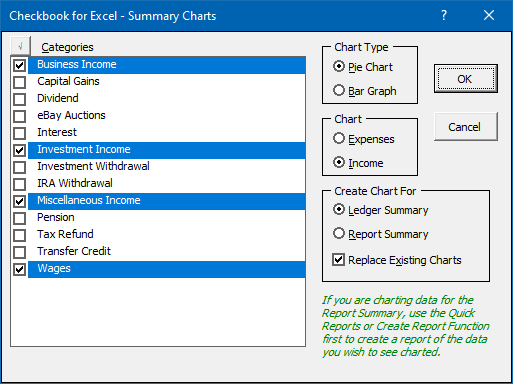
If you choose to include a large number of categories in your chart, the text labels and legend may not appear correctly.You can move the chart, make it larger or smaller, or use Excel’s charting features to improve and further customize the appearance of the chart. The Expense and Income summaries and related charts are updated automatically every time the related data changes. You can also delete a chart by simply selecting it and hitting the Delete key.
Visit Checkbook on Facebook
Visit Handicap Manager on Facebook