DJI Computer Solutions
Software Applications for Microsoft Excel
The most unique, full featured spreadsheet applications on the web. These are not your father's spreadsheets!
The most unique, full featured spreadsheet applications on the web. These are not your father's spreadsheets!
The second tab in the Report Chart form provides options for graphical summaries of the report data in the form of fourteen 3D column charts or 3D pie charts. (Depending on the nature of the data, not all charts are available in the pie chart format.) Just select the chart you wish to display and click OK. Here is an explanation of all the summary charts.
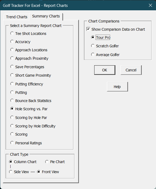
When creating Summary charts, you can choose to display comparison statistics for an average PGA tour pro, a typical scratch golfer, or an average golfer by selecting the appropriate check box and option button in the Chart Comparisons section. (This option is not available for some charts as the data was not available or it didn't make sense for that particular category.) The PGA tour pro statistics reflect the data for the average of all players on the PGA tour in 2022. The scratch golfer statistics reflect the capability of a golfer with a 0 handicap index and the average golfer statistics reflect the capability of a golfer who shoots in the mid-eighties. These comparisons allow you to track your progress as you strive to become a better golfer, or even a scratch golfer. Keep in mind that the PGA tour pros play on extremely difficult courses so there's no reason you can't strive to match their abilities on the typical golf course, especially in the approach, short game and putting categories.
All the Summary charts display as 3D column charts. An option is provided to display some of the charts as 3D pie charts where it makes sense. The pie chart option is available in Summary charts where the data is in percentages that total to 100%. When displaying 3D column charts, you also have two viewing options. The Side View option skews the columns to view them from a side angle, while the Front View options provides a more direct frontal view of the columns. You can try them both to decide which one gives you the best view of the data.
Visit Checkbook on Facebook
Visit Handicap Manager on Facebook